The user research behind HTC One’s Sense 5 interface

Drew Bamford, Director of User Experience at HTC, explains Sense 5.0 and why the company’s Android UX needed redefining.
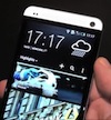
“HTC radically overhauled the look and feel of Sense UI aboard the HTC One. It removed the standard homescreen of app icons and a weather widget and replaced it with something HTC says is far more useful.
But that’s just the tip of the iceberg, says Drew Bamford, Director of User Experience at HTC. Sense 5 is more than just a UX – it’s a redefined experience born from extensive research.
‘After releasing Sense 4 last year, I challenged the team to step back and take a fresh look at the overall customer experience,’ said Bamford, writing on the HTC Blog. ‘We interviewed customers for their personal feedback and we became students of human behaviour, taking more time than ever to observe how people use their phones today.'” […]
The company’s research turned up three rather interesting points about the way in which its users interacted with Sense UXs of old. Most people, apparently, don’t differentiate between apps and widgets.
Widgets aren’t widely used – weather, clock and music are the most used and after that, fewer than 10 percent of customers use any other widgets.
Most of us don’t modify our home screens much. In fact, after the first month of use, approximately 80 percent of us don’t change our home screens any further.


