Mobile phone user experience hampered by contradictory shell and ghosts
Mobile handset are churned out at a hellish pace, with the expression extreme parallelism describing common practices quite well.
Hardware and software follow parallel development tracks, each team running after rogue deadlines imposed by different, sometimes contradicting requirements, ranging from tooling lead-times and costs on one side, to software re-use and UI-platform-alignment issues on the other… this not to mention the fact that user interface designers are often nested within software development groups, while product designers usually enjoy a higher visibility and/or more independence.
The end result is that the key touch-point among the two teams often consists in the agreement around the number and position of buttons. I am not saying this is always the case, mind you, but that it is not that uncommon either.
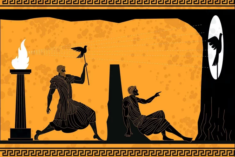
For the end-user this means an object that whispers certain qualities when turned off, and shouts contradicting values when on and in use. Shells. Ghosts.


