Bruce Tognazzini on the iPhone user experience
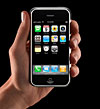
“What strikes me about the iPhone interface in general is that it gives ordinary people access to features that have been the private purview of the young and the geeky. For example, cell phones have long had contact lists, but they were typically difficult to build, maintain, and sync.” […]
“The best user interfaces are those that bring advanced features within the easy reach of inexperienced users. Such was the genius of the SRI-Xerox-Apple interface embodied in the Mac, and such is the genius of the iPhone interface. As with other smart phones, Apple starts with a full QWERTY key layout. (You may find it reasonable to spell my name, Tog, “86664,†but old folks don’t. They can’t see the little letters beside the numbers to begin with, and they don’t want to learn.) Then, Apple has made an effort to make normally abstract features, such as Call Waiting and Conferencing, not only attractive, but dead simple.”


[…] Bruce Tognazzini (Nielsen Norman Group) ha scritto una lunga analisi dell’esperienza utente dell’iPhone. La cosa che più impressiona Tognazzini è la capacità dell’interfaccia di consentire anche alle persone comuni di accedere a funzioni prima utilizzate solo dai giovani e dagli appassionati. […]