![]()

Data visualisation as an actionable tool in our lives

This week I watched the excellent online documentary “Journalism in the Age of Data“, which is a video report on data visualisation as a storytelling medium that Geoff McGhee created during a 2009-2010 Knight Journalism fellowship. I first didn’t write on it in Putting People First, as I considered it a media story. But I changed my mind.
Apart from the fact that this video provides great inspiration for interaction designers and interface designers of all sorts, and not just those working in journalism, it also inspires a wider reflection.
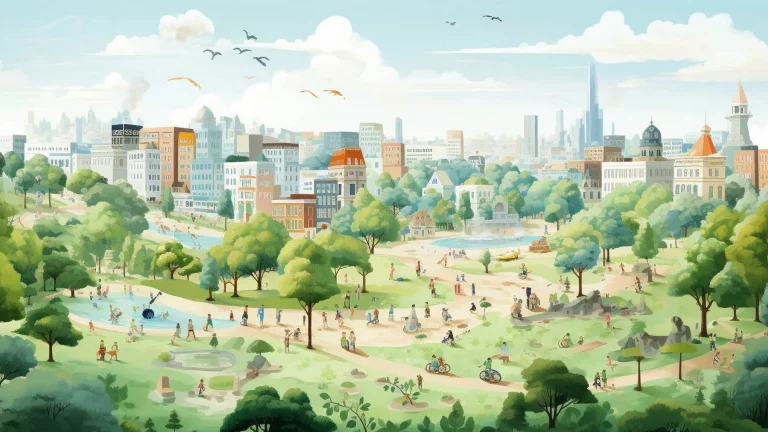
With people rapidly moving to a world inundated with data capturing devices and the resulting data streams, our challenge as UX designers is to create tools that make sense of these data, and transform this data flood into useful and actionable informational experiences that help us better conduct our lives.
Smart phone applicatins seem to me an intermediate step. Yes, indeed, one can find apps for almost any need and they are sometimes quite useful. But we cannot conduct our lives with hundreds of apps: one for parking, one for driving, one for shopping, one for dining, etcetera.
What could be the future of actionable data visualisations in a multi-sensorial world?