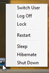
Nine different ways of turning off Windows Vista
After all, “the more choices you give people, the harder it is for them to choose, and the unhappier they’ll feel.”
He then goes on to describe how this choice could be brought down to a more reasonable number, like one.
He has a point. “This highlights a style of software design shared by Microsoft and the open source movement, in both cases driven by a desire for consensus and for “Making Everybody Happy,” but it’s based on the misconceived notion that lots of choices make people happy, which we really need to rethink.”
(via Usernomics/Usability in the News)
UPDATE 1
And here is an article by Moishe Lettvin, a member of the “Windows Mobile PC User Experience” team, explaining why this actually happened. According to Joel Spolsky, this shows that Microsoft “has become completely tangled up in bureaucracy, layers of management, meetings ad infinitum and overstaffing. […] Somehow in the fifteen year period from 1991 – 2006 they became the bloated monster that takes five years to ship an incoherent upgrade to their flagship product.”
UPDATE 2
Arno Gourdol, a software experience designer at Adobe and a former Lead of the Mac OS X Finder feature, describes the very different way that the same shutdown feature was designed in Apple’s Mac OS X operating system.


[…] Troppe opzioni non rendono più liberi; anzi, frustrano. Windows Vista disporrà di 9 modi per spegnere il sistema operativo: una scelta guidata dalla filosofia “Facciamo tutti felici”, che in realtà non funziona. Secondo Joel Spolsky, Microsoft compie questi errori perché è ormai un’organizzazione poco flessibile. […]