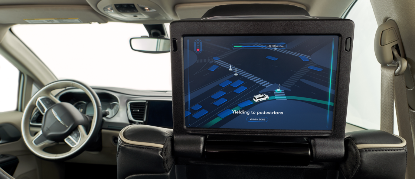
Waymo focuses on user experience

Waymo —formerly the Google self-driving car project— is investing a lot of time and effort on building out the user experience of its self-driving vehicles, which includes both the external and internal user-facing features of its autonomous cars. This includes looking at everything from how a user gets picked up during a ride-hailing experience, to communicating with others sharing the road, to how a user interacts with the car once on board – and it’s something the company is clearly investing more in now that its actual self-driving software and hardware is becoming more mature.
Darrell Etherington reports on TechCrunch.
UX design head Ryan Powell explained during a press event at Waymo’s Castle proving grounds that the goal of the user interface inside the vehicle is to provide a clear sense of what the car can see, and what the virtual driver intends to do. Research shows that a lot of the communication between a human driver and their passenger occurs non-verbally, so the challenge for Waymo has been to recreate that experience, which is generally one of mutual trust between passenger and rider, between human users and the autonomous vehicle itself. Part of the way Waymo is trying to do that is by providing riders with a visual interpretation of what the car is seeing on the road.
Key elements in the Waymo UX vision are predictability, communication and giving the passengers a sense of control.


