Why government websites are terrible and how to fix them

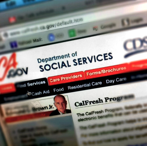
By exposing how confusing food stamp applications and other government online services can be, Citizen Onboard hopes to make them better. Anna North reports in the New York Times Op-Talk blog.
“One simple way to make government websites better, [Alan] Williams [of the nonprofit Code for America that started Citizen Onboard] told Op-Talk, is clearer copywriting: “People are used to being spoken to in plain language, and if we can speak that language, then we can make pretty complex tasks like applying for food stamps a lot simpler.â€
The Op-Ed piece cites a 2013 New York Times Op-Ed, in which Clay Johnson and Harper Reed argue that shoddy websites are a result of “the way the government buys things.â€
“The government has to follow a code called the Federal Acquisition Regulation, which is more than 1,800 pages of legalese that all but ensure that the companies that win government contracts, like the ones put out to build HealthCare.gov, are those that can navigate the regulations best, but not necessarily do the best job.â€
Mr. Williams agrees, writes North:
“The way the government has been legally able to buy technology in this country has forced them to scope out the entire technical and feature requirements of a service at the outset and then buy those services for a very large sum of money. A better approach is one that eschews declaring that you know everything that’s needed out front, and instead focuses on user-centered design and user research and iterative development, and building something that works over time by observing how people interact with the software.†[My emphasis]


