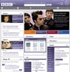
A lick of paint for the BBC homepage
“It was a no-brainer to move to a layout that would be cleaner, more open and more easily readable. There was also a desire to get away from the tired and monotonous blue base colour of the original page.
From a conceptual point of view, the widgetization adopted by Facebook, iGoogle and netvibes weighed strongly on our initial thinking. We wanted to build the foundation and DNA of the new site in line with the ongoing trend and evolution of the Internet towards dynamically generated and syndicable content through technologies like RSS, atom and xml. This trend essentially abstracts the content from its presentation and distribution, atomizing content into a feed-based universe. Browsers, devices, etc therefore become lenses through which this content can be collected, tailored and consumed by the audience.
This concept formed one of the most important underlying design and strategic elements of the new homepage. The approach has the added benefit of making content more accessible, usable, and more efficient to modify for consumption across a wider array of networks and devices.


