Torino tags its monuments for tourists
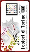
If you want to know more about a certain attraction (currently only 10 key destinations are tagged), you just download a free mobile app, scan the associated Microsoft Color Tag with your mobile phone, and you’re automatically connected to relevant online resources (as described on a Microsoft blog).
Unfortunately, very little thinking and design has gone into the design of the resources and information one finally gets access to: not mobile specific, not very relevant, and not very much in depth.
The project seems gimmicky and remains at the level of a technical or marketing experiment. The user experience is poor and disappointing. Clearly no experience designer or service designer was involved here.
How is it possible that Microsoft still launches projects that are portrayed as providing value for real people, but in fact do not provide any meaningful value for them at all? Unless Microsoft Italia urgently does some drastic work on the user experience, the value here is only one of public relations for the entities involved.


