UX and the design of news at BBC World Service
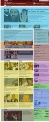
“I liken the design of a news site to that of the Japanese Bento box. There is a bounding tray and small dishes in a variety of shapes and sizes that can be arranged in different combinations. This is our site design. The food they hold is the changing news content. It is the harmony between the two, the box and the food, that determines the way we will experience this meal.
The food is the main attraction to the diner. But would it be so delectable if not presented with such finesse? To achieve this presentation the box designer has to understand the food (the content) and the diner’s needs and tastes (user behaviours).”


